3D Artist, Character Modeller, Animator. Portfolio of personal work and works in progress.
22/05/2009
20/05/2009
Progression Project - Finished Products
Interface

When the mouse is over the different biped stills, the name of the trick appears.

Clicking the biped or the trick name opens the trick tip for that particular trick over the current window.
Here are the finished trick tips, the actual videos are a lot better quality.
Ollie
Kickflip
Pop Shuv-it
Varial Kickflip

When the mouse is over the different biped stills, the name of the trick appears.

Clicking the biped or the trick name opens the trick tip for that particular trick over the current window.
Here are the finished trick tips, the actual videos are a lot better quality.
Ollie
Kickflip
Pop Shuv-it
Varial Kickflip
Labels:
3d,
3ds max,
animation,
dvd,
flash,
skateboarding,
skatepark,
skeleton,
trick tips,
videos
Progression Project - Animation Development
After deciding on my idea and modelling the board, I carried out a test to see how easily and successfully I could make the board flip using keyframes and tweening.
Although the board clearly has no wheels and the animation doesn't look realistic or interesting, the point was to use keyframing to flip and spin the board as desired, in which case it was a success.
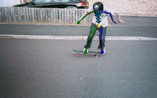
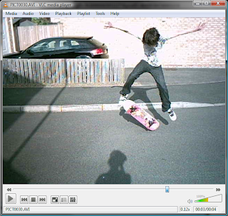
My primary source of research and reference material was my own footage: I recorded myself performing the tricks so I could animate my character over it.
My primary source of research and reference material was my own footage: I recorded myself performing the tricks so I could animate my character over it.
As you can see the camera I used recorded at a measly 8fps, which didn't prove to be very useful as a direct reference material. The footage was too short and there was just too big a gap between the frames which gave a very jolty result. I spaced the frames out so the animation was longer and 3DSMax would fill in the missing movements, but it just animated the easiest route between two points, not the most anatomically accurate.
The footage was still very useful however, especially when positioning the body accurately throughout different stages of the tricks.

I also used one piece of footage to create this animation in Adobe Flash. The low frame rate works well with animated gifs like this, but not for detailed clips which will be viewed closely. This didn't have any place within my final product, but if mirrored it could be used to make a fairly effective loading screen.

As well as recording my own footage, I watched professionally made skate videos such as The DC Video and Blind's What If. I also made use of the Replay Editor in the Skate 2 video game to perform tricks and view them back at several angles and speeds, something that wasn't possible with my own footage. The animations within Skate 2 were created using motion capture, so they are obviously reliable and accurate to use as references.

A side by side comparison of my footage and Skate 2 shows similar body positions, so I knew my animations would be fairly consistent despite using different reference materials.


Progression Project - Modelling Development
Character Design
Before I settled on my idea, I thought about the kind of thing I wanted to do, and character modelling and animation was one of the main things I wanted to cover. While I was considering this, I created simple mini caricatures of myself. My idea was to create mini trick tips


I didn't think I would have enough time to learn how to model a character and animated it successfully within the timescale allowed, so I decided I would use the biped integrated in 3DSMax, and chose to explore the movements of the human body while skateboarding.
Surroundings
The environment was something I had to think about a lot, as I felt if I created something extremely realistic as the scene, the biped might look out of place, or like I had forgotten to make a character.
I thought about the purpose of my product, which was a sort of scientific tutorial where the focus would be on the model, and decided a simpler background would add to the scientific feel and would be better suited than a more realistic one. I experimented with the idea of using mesh materials in vibrant, electric looking colours to create a grid of light, slightly reminiscent of those featured in the Tron movie. I feel the end result gave my videos a nice scientific, almost futuristic look.
Biped Appearance
I experimented with the different types of biped offered in 3DSMax to see which would best complement the look and purpose of my animations.
I liked the skeleton model as I had already been using it when creating the animations, but the male model was more fleshed out, which would give the animations a more true-to-life appearance. In the end I decided the skeleton model would work best as my purpose was to show the movements behind each trick very clearly and simply, stripped to the bare bones so to speak.
I thought about how I could give the biped character and make him more exclusive to my product while still keeping him simple, and sketched a few ideas I had.
I also began to think about a brand name to relate to the biped. Incorporating the skeleton idea, I created the brand 'Bruised Skull Skate Company'.
To further this, I created a 'bruise' map in Photoshop, and applied it to the skull of the biped. I had slight problems positioning the bruise as I intended, as it rendered in a different position to how it appeared when modelling, but I think it still has the effect I was going for.


Board
To create the board I used a method called box-modelling, in which I started with a box (hence the name) and edited the wireframe to create the rounded edges and the concave of the board, with symmetry modifiers to make it symmetrical.

The trucks were the most complicated part of the modelling process, as they are made up of lots of parts. I made each part separately and scaled and arranged them correctly using an actual truck as a reference.
For the board I used a multi object map assign different materials to different areas of the board (griptape, wood, graphic), and with the truck I assigned each part a material individually.
This is the image I used for the board graphic, I created it as the background for the foot placement renders but also wanted to use the line design on the board.
Below are some detail images of the individual parts and their components as well as the fully assembled skateboard.
Before I settled on my idea, I thought about the kind of thing I wanted to do, and character modelling and animation was one of the main things I wanted to cover. While I was considering this, I created simple mini caricatures of myself. My idea was to create mini trick tips


I didn't think I would have enough time to learn how to model a character and animated it successfully within the timescale allowed, so I decided I would use the biped integrated in 3DSMax, and chose to explore the movements of the human body while skateboarding.

Surroundings
The environment was something I had to think about a lot, as I felt if I created something extremely realistic as the scene, the biped might look out of place, or like I had forgotten to make a character.
I thought about the purpose of my product, which was a sort of scientific tutorial where the focus would be on the model, and decided a simpler background would add to the scientific feel and would be better suited than a more realistic one. I experimented with the idea of using mesh materials in vibrant, electric looking colours to create a grid of light, slightly reminiscent of those featured in the Tron movie. I feel the end result gave my videos a nice scientific, almost futuristic look.
Biped Appearance
I experimented with the different types of biped offered in 3DSMax to see which would best complement the look and purpose of my animations.
I liked the skeleton model as I had already been using it when creating the animations, but the male model was more fleshed out, which would give the animations a more true-to-life appearance. In the end I decided the skeleton model would work best as my purpose was to show the movements behind each trick very clearly and simply, stripped to the bare bones so to speak.
I thought about how I could give the biped character and make him more exclusive to my product while still keeping him simple, and sketched a few ideas I had.
I also began to think about a brand name to relate to the biped. Incorporating the skeleton idea, I created the brand 'Bruised Skull Skate Company'.
To further this, I created a 'bruise' map in Photoshop, and applied it to the skull of the biped. I had slight problems positioning the bruise as I intended, as it rendered in a different position to how it appeared when modelling, but I think it still has the effect I was going for.


Board
To create the board I used a method called box-modelling, in which I started with a box (hence the name) and edited the wireframe to create the rounded edges and the concave of the board, with symmetry modifiers to make it symmetrical.

The trucks were the most complicated part of the modelling process, as they are made up of lots of parts. I made each part separately and scaled and arranged them correctly using an actual truck as a reference.
For the board I used a multi object map assign different materials to different areas of the board (griptape, wood, graphic), and with the truck I assigned each part a material individually.
This is the image I used for the board graphic, I created it as the background for the foot placement renders but also wanted to use the line design on the board.
Below are some detail images of the individual parts and their components as well as the fully assembled skateboard.
Subscribe to:
Posts (Atom)


